cmyk

Choose between CMYK vs RGB for your designs

This guide will cover everything you need to know about CMYK and RGB and which is best for your design.

What is the Difference Between CMYK and RGB?

When it comes to creating visually appealing content, understanding the difference between CMYK and RGB is crucial. These color models are widely used in various applications, but they have distinct purposes and characteristics. Let’s explore the key differences between CMYK and RGB:

RGB for Digital Work

RGB, which stands for Red, Green, and Blue, is primarily used for digital work. It is an additive color model where the primary colors are combined to create a wide range of hues. When you see vibrant displays on your computer screen, mobile devices, or television, they are all created using RGB.

Branding, social media graphics, web design, and other digital content benefit greatly from the RGB color model. Its wide color gamut and ability to display vibrant and rich colors make it ideal for creating visually stunning digital assets.

CMYK for Print Projects

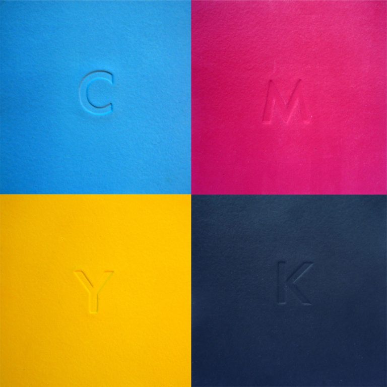
CMYK, which stands for Cyan, Magenta, Yellow, and Key (Black), is predominantly used for print projects. It is a subtractive color model that applies different ink combinations to achieve the desired colors. CMYK is commonly used in offset printing, digital printing, and other printing techniques.

When creating merchandise, advertising materials, brochures, and other printed materials, CMYK is the go-to color model. It ensures accurate color reproduction and consistency in print, resulting in high-quality outputs.

What Programs Use CMYK and RGB?

When it comes to graphic design software, CMYK and RGB are two popular color spaces used to create stunning visuals. Whether you are a professional graphic designer or an aspiring artist, understanding the difference between CMYK and RGB and knowing which programs support these color spaces is essential. In this article, we will explore the programs that utilize CMYK and RGB, providing you with the tools you need to bring your creative ideas to life.

Graphic Design Software

Adobe is a prominent name in the world of graphic design, and their suite of software programs, including Photoshop, Illustrator, and InDesign, support both CMYK and RGB. These powerful tools provide a vast range of features and options, allowing users to manipulate colors, create stunning images, and design professional layouts. Whether you’re working on a digital project or preparing designs for print, these industry-standard programs have got you covered.

In addition to Adobe’s suite, there are other graphic design software programs available that support both CMYK and RGB. CorelDRAW, for example, is a popular alternative that offers similar functionality. Affinity Designer, Sketch, and GIMP are also excellent choices for digital artists and designers looking to work in both color spaces.

Canva

If you prefer a more user-friendly and web-based design tool, Canva is a fantastic option. Initially, Canva only supported RGB color space, which is suitable for online designs. However, due to the increasing demand for print-ready designs, Canva now allows users to download their creations in CMYK color space as well. This feature is extremely useful for individuals who want to send their designs directly to print or collaborate with professional printing services.

Canva’s intuitive interface and vast library of pre-designed templates make it accessible for users of all skill levels. Whether you’re designing social media graphics, flyers, or business cards, Canva’s support for both CMYK and RGB ensures that your designs will look fantastic in any medium.

When it comes to graphic design software, having the ability to work in both CMYK and RGB color spaces is essential. Programs like Adobe Photoshop, Illustrator, and InDesign offer robust features for professional designers, while Canva provides a user-friendly web-based platform suitable for beginners and casual users.

Whether you’re creating digital graphics or preparing designs for print, understanding and utilizing CMYK and RGB will help you achieve the desired outcome. So, choose the software that best suits your needs and let your creative ideas shine.

How to Get the Best Print Color in Photoshop

When it comes to printing your digital designs or photographs, getting the color just right is crucial. The colors you see on your computer screen might not translate accurately to print, which can result in disappointing outcomes. However, by following a few simple steps in Photoshop, you can ensure that the colors in your prints are vibrant and true to your original vision.

Switch to CMYK Color Space

First and foremost, it is important to understand the difference between RGB (Red, Green, Blue) and CMYK (Cyan, Magenta, Yellow, Key) color spaces. RGB is the color mode used for digital screens, while CMYK is the standard for print. To get the best print color in Photoshop, you need to switch from RGB to CMYK.

To do this, you can begin by creating a new document in Photoshop and selecting CMYK as the color mode. This ensures that you start with the appropriate color space for print. Alternatively, if you already have an existing image or design in RGB, you can convert it to CMYK by going to the “Image” menu, selecting “Mode,” and then choosing “CMYK Color.”

Adjusting Colors for Print

Converting to CMYK alone is not enough to guarantee accurate print colors. You may also need to make additional adjustments to achieve the best results. Once you have switched to CMYK, open the “Image” menu again and select “Adjustments.” From there, you can fine-tune the brightness, contrast, and saturation of your image specifically for print.

Keep in mind that the colors you see on your computer screen are created using light, while printed colors are created using ink. This means that certain vibrant colors that are easily achievable in RGB may not be as achievable in the CMYK color space. It’s important to experiment and find a balance that maintains the integrity of your design while considering the limitations of print.

Soft Proofing for Print

Another helpful feature in Photoshop is the “Soft Proofing” function, which allows you to preview how your image will appear in print. To use this feature, go to the “View” menu, select “Proof Setup,” and then choose the appropriate CMYK profile for your printer or printing service.

Soft proofing gives you a more accurate representation of how your print will look by simulating the specific printer profile and the characteristics of the printing process. It can help you identify any potential issues, such as colors that are out of gamut and may not reproduce as desired. By adjusting your colors based on these soft proofing results, you can ensure that the final print closely matches what you see on your screen.

Switching from RGB to CMYK color space and making necessary adjustments in Photoshop are vital steps to ensure the best print color. However, it’s important to note that the final result is also influenced by factors beyond your control, such as the type of printer, paper, and ink used. To achieve the most accurate print colors, it’s advisable to consult with a professional printing service and request proof prints before committing to a large batch.

Do I Need to Convert RGB to CMYK for Printing?

When it comes to printing, accurate color reproduction is vital. In order to ensure that the colors in your artwork and files appear as intended, it is necessary to convert RGB (Red, Green, Blue) colors to CMYK (Cyan, Magenta, Yellow, Key) colors. Let’s explore why this conversion is important and how it affects the final printed product.

The Difference Between RGB and CMYK

RGB is the color space used for digital displays such as computer screens, cameras, and smartphones. It is an additive color model where the combination of red, green, and blue light creates various colors. On the other hand, CMYK is the color model used in printing. It is a subtractive color model where colors are created by subtracting different amounts of cyan, magenta, yellow, and black ink from a white background.

Why Convert RGB to CMYK for Printing?

Colors can appear differently when printed in CMYK compared to what you see on your screen in RGB. RGB has a wider color gamut, meaning it can produce a broader range of colors than CMYK. Therefore, if you provide artwork or files in RGB for printing, there is a possibility that the printed colors may not match your expectations or the vibrant hues you see on your screen.

Converting RGB to CMYK allows you to have more control over the color output during the printing process. By making this conversion, you can adjust the colors to ensure they appear as intended on the final printed material. This is particularly important for businesses and individuals who require color accuracy in their printed materials, such as designers, photographers, and marketing professionals.

Supplying Artwork and Files for Printing

Before submitting your artwork or files for printing, it is crucial to convert them from RGB to CMYK. You can easily do this using professional graphic design software such as Adobe Photoshop or Adobe Illustrator. These programs have color conversion options that allow you to make the necessary adjustments and ensure the colors translate accurately to the CMYK color space.

When converting from RGB to CMYK, it’s important to keep in mind that some colors may not have an exact match in the CMYK color space. This means that certain vibrant or neon colors may appear duller when printed. To avoid any surprises, it’s always a good idea to request a physical proof or a color swatch from your printing service provider before proceeding with a large print run.

Converting RGB to CMYK for printing is a necessary step to achieve accurate color reproduction. While it can be disappointing to see the vibrancy of RGB colors diminish when printed in CMYK, this conversion allows you to have better control over the final printed result. By making the conversion and checking the colors before printing, you can ensure that your printed materials look exactly as you intended them to, bringing your designs to life with precision and accuracy.

RGB or CMYK for Digital Art

When it comes to creating digital art, one of the important considerations is choosing the right color mode. The two most commonly used color modes are RGB (Red, Green, Blue) and CMYK (Cyan, Magenta, Yellow, Black). Each of these color modes has its advantages and is suitable for different purposes. In this article, we will explore when and why you should use RGB or CMYK for your digital artwork.

RGB for Digital Art

If your digital art will exclusively be used digitally, then RGB is the best option. RGB is an additive color model that produces colors by combining varying intensities of red, green, and blue light. This color mode is widely supported by digital devices such as computer screens, smartphones, and tablets. By creating your digital art in RGB, you can ensure that the colors will be displayed accurately and vibrantly on these devices.

With RGB, you have a wider range of colors to work with compared to CMYK. This is because RGB is capable of producing more vibrant and intense colors. It is ideal for creating artworks that rely on bright and saturated hues, such as digital illustrations and graphics for websites.

CMYK for Print

On the other hand, if you plan to print your digital art, it is recommended to convert it to CMYK for better color accuracy. CMYK is a subtractive color model used in the printing industry, where colors are created by subtracting varying amounts of cyan, magenta, yellow, and black ink.

Unlike RGB, CMYK colors may appear less vibrant and bright when printed. This is because the printing process has limitations in reproducing certain intense colors. However, CMYK offers a wider gamut for softer and more nuanced colors, making it suitable for printed materials such as posters, brochures, and art prints.

Considerations for Choosing the Right Color Mode

When deciding whether to use RGB or CMYK, here are some factors to consider:

  • Intended Use: If your digital art is meant for screen display only, RGB is the way to go. If you anticipate printing your artwork, then converting it to CMYK is necessary.
  • Color Accuracy: If color accuracy is crucial for your artwork, CMYK provides better control over how the colors will appear in print.
  • Impact of Conversion: Keep in mind that converting RGB artwork to CMYK may cause slight color shifts, so it’s recommended to make any necessary adjustments before the conversion.

Tip: When working on a digital art project that will potentially be both digitally displayed and printed, it is advisable to create your artwork using a larger color workspace, such as Adobe RGB or ProPhoto RGB. This will give you more flexibility when converting to CMYK for printing while preserving the vibrant colors for digital displays.

Ultimately, the choice between RGB and CMYK for digital art depends on where and how the artwork will be used. By understanding the characteristics and limitations of each color mode, you can ensure that your digital artwork looks its best, whether it’s on a screen or in print.

Prepping File for Wall Art

If you plan to sell wall art, it’s important to consider the color mode of your digital designs. Wall art should be in CMYK format to ensure the colors appear the same when printed as they do on screen.

When creating digital designs for wall art, it’s essential to take into account how the colors will translate from the digital screen to the final printed product. The color mode used in your design files can greatly impact the final result.

CMYK, which stands for Cyan, Magenta, Yellow, and Key (black), is the standard color mode for professional printing. Unlike RGB (Red, Green, Blue), which is used for digital displays, CMYK is optimized for printing with ink on paper. It’s crucial to work in CMYK mode when creating wall art to ensure that the colors are accurately represented in the final print.

When a design file is in RGB mode, it uses a wider color gamut than CMYK, which means it can reproduce colors that are outside the range that can be printed. This can lead to a discrepancy between the colors seen on the screen and those produced in the print. Colors that appear vibrant and bright on a digital display may appear dull or different when printed in CMYK.

Converting your design files to CMYK before printing is essential to achieving the desired results. Most professional design software, such as Adobe Photoshop or Illustrator, allows you to easily switch between color modes. Simply select the CMYK color mode before starting your design or convert the file before sending it for printing.

In addition to the color mode, it’s also crucial to consider other aspects of prepping your file for wall art. This includes ensuring that your design has the proper resolution for printing, using the correct file format (such as TIFF or PDF), and providing any necessary bleed or trim areas. These factors will vary depending on the specific requirements of your printing method.

By taking the time to prep your file correctly, you can ensure that your wall art looks just as intended when printed. This will help you deliver a high-quality product to your customers and build a reputation for professionalism and attention to detail. Remember, the right color mode can make a significant difference in how your wall art is perceived, so always work in CMYK for print.

To summarize:

  • RGB is best for branding, social media graphics, web design, and other digital content.
  • CMYK is best for branding, merchandise, advertising, and other printed materials.

By optimizing your color choices for each medium, you can create visually striking and consistent content that effectively communicates your message.

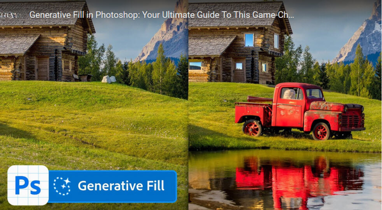
Transform Images with Mind-Blowing Generator Fill in Photoshop

Have students click/scan on the QR code below in your classroom.

Transcript of video

This new Photoshop tool is going to change design and photography forever. Guaranteed. The new AI power generator fill in Photoshop allows you to seamlessly remove complex objects from your photos, extend images by adding realistic details, generate realistic objects and generate new believable backgrounds. My name is Jesus Ramirez and I’ve been a professional graphic artist for almost 20 years, and I must say, I’ve never been more excited, amazed, and slightly terrified about a new feature in Photoshop. I think this tool is going to be a huge game changer as much as layers were when they were first introduced back in Photoshop 3, maybe even more.

This video will be a complete and comprehensive guide on the generator fill. I’ll cover all its capabilities and its downsides. Do me a favor, if you learn something new, hit the like button, subscribe and share this video with a friend. The generate fill feature is now available through the Photoshop beta, which you can access through the Creative Cloud app under the beta apps tab. First, make sure you have an internet connection.

Photoshop will process your prompts through the cloud. I’ll start by showing you how to generate objects, then we’ll move to the other capabilities. The first step is to create a selection. You can use any selection tool you like. I’ll use the lasso tool and freehand a selection over the couch.

You should now see that contextual taskbar next to the selection. If you don’t, go into the window menu to enable it. From here, you can click on Generate a Fill to enter your prompt. At the time of this recording, you can only use prompts in English. They should be descriptive using adjectives and nouns.

For example, you can type the prompt, a sleeping fluffy grey cat, then click on Generate, and Photoshop will send the prompt to the cloud to generate my image. For this first prompt, I’ll let it generate in real time so you get a sense of how long it takes, but I will speed up the process in future renders to save time on this video. That took about 12 seconds and the results are incredible. We got exactly what we asked for. Photoshop matched the lighting, perspective, color and everything else to make this composite look realistic.

But seriously, this is insane. Let me know what you’re thinking as you’re watching this. Let’s now look at the result and how it all works. All this was generated in a new layer, allowing you to work non-destructively. Also notice 3 things.

First, this layer has a layer mask containing the object we generated. The layer name shows the prompt we used. And on the bottom right of the layer thumbnail, you’ll see a brand new icon. This icon indicates that this is a Generator Fill Layer. And when a Generator Fill Layer is active, the Properties panel gives you more options.

You can see the prompt you use and 3 variations. You can click on them to apply them to your image and keep the 1 you like best. If you’re unhappy with the results, click on generate from the properties panel to add 3 more variations. You will not lose the original 3. From the properties panel, you can change the prompt.

For example, We can change it to an orange cat. Now we have 3 orange cat variations alongside the 6 gray cats. When you click on any of the variation icons, the prompt will change to display the prompt used to generate that particular fill. We can Now add 1 more set, but this time we’ll change the prompt and we’ll make it into a sleeping fluffy brown dog. And now you can decide between these 12 cats and dogs to use in your image.

By the way, if you dislike 1 of the variations, you can just click on the X to remove it. You can keep adding variations if you like, but each variation will increase your file size. I recommend deleting the ones that will not work for your project. Also, keep in mind that instructional prompts are not supported. For example, The prompt, make the dog bigger, will not work.

Photoshop will generate different dogs and they’re not much bigger. Now, let me show you how insane the generator fill is at creating water and reflections. You will never need another water plugin ever again. In this image, I have a selection on the bottom half and I use the prompt lake with calm reflective waves. And look at how well the water contours around the pyramid and how realistic the reflections look.

Let me show you another example with reflections that I really think you’ll like. With the ground selected, I use the prompt reflective wet ground. Photoshop will then generate an image that looks incredibly realistic. The reflections on the woman, the cab, and the surrounding buildings are so realistic. And the same thing is true on the other variations.

It’s incredible that you can do all this with just a few clicks. Here’s a tip for when you generate an object but you don’t like the placement. For this example I use the prompt old classic 1950s car and I get a pretty good result. But if I decide to change the position with the move tool You will notice that I also will move the background around the car. Photoshop will generate new pixels over the entire selection you created.

It will not have transparent pixels. If you want the car in this new area, click on the generate button in the properties panel to generate a new car. Unfortunately, there’s no way to keep the previously generated car. These cars are similar, but not exactly the same. Hopefully Adobe has this feature in the future.

Also, another thing to keep in mind is that you don’t need to type HD, 4K, a camera type or anything like that in your prompt like you do in Mid Journey because Photoshop is looking at the content of your image to generate the object. I’ve also tested adding clothing to people. I already have a selection active around my shirt and my arms and I’m going to use the Generative Fill to add a leather jacket over my body. You can also hit the enter or return key to apply the generative fill. And Photoshop doesn’t always do a good job.

This jacket makes me look really skinny, which I probably need in real life. But in this photo, it doesn’t work. The variations are not much better. If your fill generations don’t work, try hitting the generate button a few more times and see if you can get something you can work with. It looks like Photoshop is really struggling with this leather jacket.

I’ll keep trying a few more times to see if I can get something that works. And after clicking on the generate button a few more times and coming up with horrific images like this 1, I think I was able to find 1 that will work for this image. That one’s not too bad, but I think that this 1 here is something that I can definitely work with. Next, let’s talk about the importance of Selections with the Generated Fill. With the Marquee Tool active, I’m going to make a selection around my head.

And I’ll use the prompt Blonde Hair and click on Generate. I will get blonde hair, but it will also replace my face because the selection was also covering my face. And Photoshop replaces all the pixels within the selection. There is no transparency. So as you can see, I did get the blonde hair, but that is definitely not my face.

And this also showcases 1 of the downsides with the general fill. Faces don’t look very realistic. So what you need to do instead is create a selection on the areas you want to remove and make sure you disregard the areas you want to keep. So I’m just gonna make a quick Lasso Tool selection around my hair. And again, I’ll give the same prompt to blonde hair.

And the results are much better. What do you think? Now let me show you what to do when you want to generate something with transparency. I have a rectangular marquee selection over my face and I will use the prompt glasses. Now even though these glasses look like they have transparency, they really don’t.

These are AI generated eyes. They’re not my eyes. I think this variation gives you a better example of that. And when you zoom in, you can really tell that those are definitely not my eyes. So if you’re working on an image like this 1 where you need transparency, what I recommend that you do is work with the layer mask.

You can click on the layer mask and now from the contextual bar, you can click on subtract from mask to make the foreground color black and When you paint over the mask with black, you will hide the generated pixels revealing the original layer. You can use the bracket keys on the keyboard to resize your brush as you paint. You always have access to the traditional tools in Photoshop to help you make the generated images work. Now let’s generate a background. You can generate portions of a background by making a selection over your image.

I’ll use the polygonal lasso tool to select the right side. Then I’ll use the prompt Building with Reflective Windows. And the results are simply stunning. Look at how well the reflections match the original background on all the variations. Let’s now generate a complete background.

From the contextual taskbar, click on select subject to select the man and then click on this icon to invert the selection. Then click on the Generative Fill button and use any prompt you like. I’ll go with mountains with trees and the lake. Generative AI does really well with landscapes and as you can see, all the variations are very realistic. Again, none of these are real images.

They were generated by Photoshop. Another cool thing you can do with the Generate Fill is create a background piece by piece. This is a new document, it’s 1920 by 1080, and with the Rectangular Marquee Tool, I’ll select the bottom part of the canvas and I’ll use the prompt long grass field with patches of dirt. And look at these incredible variations, they all look so realistic. For this composite, I’ll go with the second variation.

Now make a selection around the top part and use the prompt, overcast sky with clouds and distant mountains. And again, the results are mind-blowing. Look at all the variations, they look very realistic. In this case, I’ll stick with the first 1. And now you can add elements to this background.

Make a selection and use the prompt, old broken down red barn, and Photoshop will create 3 amazing variations that will match the perspective, lighting, and everything else in the scene to make this into a realistic composite. For this image, I’ll stick to the third variation. Then I’ll enable the Lasso Tool and make a selection on the bottom left of the image. And I’ll use the prompt, Rocky Creek with reflective water. And again, no surprise, Photoshop does an amazing job in generating the creek with the reflective water.

There’s not so much water in the second 1, and the third 1 looks amazing and it’s the 1 that I’ll stick to for this composite. And it’s astounding that we can create a realistic composite just by using a few selections and prompts inside of Photoshop. As you’re watching this, let me know how you feel about this new technology. Are you excited? Are you worried?

What’s going through your mind? Let’s now talk about outcropping or extending images. To me, this is 1 of the most useful features of a generative fill. If you have an image like this 1 and you want to extend the background to change the aspect ratio, you can enable the crop tool and drag the handles to increase the canvas size. Commit the changes.

Now enable the Rectangular Marquee Tool and select each side. Make sure to include a tiny portion of the original image. Hold Shift and do the same on the other side. Now Click on the Generator Fill button and leave the prompt empty. Don’t type anything in.

Just hit the Generate button. And now Photoshop will figure out what the transparent area should look like. And the results are just mind-blowing. Look at these variations. Isn’t this just incredible?

Photoshop matched the lighting, color, perspective, and shadows. This would have taken hours to complete in the past. But as great as it looks, there is a downside. At the time of this recording, the Generate Fill can only generate images that are 1080 pixels wide on the longer side. If you’re working with a selection larger than that, Photoshop will stretch the resulting 1080 image to fit the larger area.

In some cases, there will be noticeable pixelation. When you’re extending an image or doing anything that requires a large selection, I recommend splitting the selection into multiple parts instead of generating 1 1080 image and scaling it to cover the entire canvas. You will get better results by generating multiple images and stretching them over smaller areas. It’s not perfect, but definitely better. In this example, you can start by selecting the left side of the image and use a Generative Fill over that section.

Again, leave the prompt empty. And then do the same on the other side. And generate the fill. Again, the completed image looks fantastic. And when you zoom in, you’ll see less vexillation and everything looks more cohesive.

It’s not perfect, but definitely better. Another huge advantage of doing the background extension on multiple parts is that you can select the variation you like best for either side. For example, you’re not stuck with a great left side and a not so great right side. Here’s a trick you’re going to love. Photoshop did a great job of figuring out what would be on either side of the image.

But what if you wanted to add something specific to, say, the right side? You can certainly do so. Select the right side and from the properties panel, add any prompt you like. I’ll add lake with mountains in the background. Then click on the generate button and just look at these results.

It’s truly insane how realistic these variations are. Now, in my experience, most things look great when you expand them out horizontally, but I’ve come across a few issues when expanding images vertically, usually because the generated portions of human bodies or animals don’t look as convincing. You can definitely use some of these results and spend some time with traditional Photoshop tools to make them work But it will not always be a one-click solution However, I’m convinced that this technology will only get better as time goes on and soon This will not be that big of an issue. Now, let’s talk about removing objects This is an area where the Generator Fill really shines. Just by making a rough selection and leaving the prompts empty, you can generate realistic content to make it seem that people were never there.

Think about all the amazing vacation photos you’re going to have. The Generator fill is also great at removing people who are interacting with others in a photo. In this case, I have a loose selection around the man, and I’ll click the generate button without a prompt. And Photoshop will do a great job in removing the man from this image. During my tests, sometimes I got a result without an arm and other times it had an arm.

If this happens to you and Photoshop generates an object you don’t want, simply make a selection around that distracting object and run the Generator Fill again. The results are pretty good. You can also look at the other variations to see if there’s anything you like better. And here’s an advanced technique. You might remember a tutorial I did a few years ago called How to Remove Anything from a Photo in Photoshop.

It was a popular video. It received 6.4 million views and it showed advanced techniques to remove the car from this image. The video was about 20 minutes long, but in reality it took about an hour to remove the car. But with the Generate Fill, we can do it all in just under 1 minute. Start by making a loose selection around both the car and the woman.

I’m using the Lasso Tool, but You can use any tool you like and remember you don’t have to be precise. Just make sure you select both elements. Then from the contextual taskbar generate with an empty prompt. And as you would expect the results look fantastic. We now have a clean background plate and we’re going to use this to remove the car.

Now select the layer mask and fill with black. Black is currently my background color, so I’ll press Ctrl and Backspace to fill the layer mask with black. A black mask will hide all the contents of a layer. In this case, the mask hides the generated fill. Now, enable the original layer, then click on the Select Subject button from the contextual taskbar to make a selection around the woman.

Then click on this icon to invert the selection so that the background is selected. Now click on the mask to enable it, then enable the brush tool, and with white, paint over the blue card to make it disappear. By painting with white on the mask, we’re selectively revealing the generated pixels. And if you made it this far, give this video a like and subscribe.

Beginning Graphic Design: Fundamentals

Have students click/scan on the QR code below in your classroom.

Transcript of video

The fundamentals of design are the basis of every visual medium, from fine art… to modern web design… even small details, like the fonts that make up most compositions. What do these examples have in common? Some very basic elements, including line, shape, form, texture, and balance. They might not seem like much on their own, but together, they’re part of almost everything we see and create. The fundamentals can be intimidating, especially if you don’t consider yourself an artist.

However, there’s a lot they can teach you about working with different assets, and creating simple visuals from scratch. Let’s start at the beginning with 1 of the most basic elements of all—the line. A line is a shape that connects 2 or more points. It can be fat or thin, wavy or jagged. Every possibility gives the line a slightly different feel.

Lines appear frequently in design—for example, in drawings and illustrations, and graphic elements like textures and patterns. They’re also common in text compositions, where they can add emphasis… Divide or organize content… Or even guide the viewer’s eye. When working with lines, pay attention to things like weight, color, texture, and style.

These subtle qualities can have a big impact on the way your design is perceived. Look for places where lines are hiding in plain sight, for example, in text. Even here, Experimenting with different line qualities can give you very different results. A shape is any two-dimensional area with a recognizable boundary. This includes circles, squares, triangles, and so on.

Shapes fall into 2 distinct categories—geometric, or regular, and organic, where the shapes are more freeform. Shapes are a vital part of communicating ideas visually. They give images heft, and make them recognizable. We understand street signs, symbols, and even abstract art largely because of shapes. Shapes have a surprising number of uses in everyday design.

They can help you organize or separate content, create simple illustrations, or just add interest to your work. Shapes are important because they’re the foundation of so many things. Learn to look for them in other designs, and soon, you’ll start seeing them everywhere. When a shape becomes 3D, we call it a form. Forms can be three-dimensional and exist in the real world… or they can be implied, using techniques like light, shadow, and perspective to create the illusion of depth.

In two-dimensional design, form makes realism possible. Without it, a bouncing rubber ball is just a circle. A 3D building is just a series of rectangles. Even flat designs use subtle techniques to hint at form and depth. In everyday compositions, the purpose of form is the same, but on a smaller scale.

For example, a simple shadow can create the illusion of layers, or give an object a sense of place. Basic forms can bring a touch of realism to your work—a powerful tool when used in moderation. Texture is the physical quality of a surface. Like form, it can be three-dimensional—something you can see and touch—or it can be implied, suggesting that it would have texture if it existed in real life. In Design, texture adds depth and tactility to otherwise flat images.

Objects can appear smooth, rough, hard, or soft, depending on the elements at play. For beginners, textures make great background images, and can add a lot of interest to your work. Look closely, and you may find texture in unexpected places, like distressed fonts and smooth, glossy icons. Just be careful not to go overboard. Too much texture in a single design can quickly become overwhelming.

Balance is the equal distribution of visual weight. In other words, how much any 1 thing attracts the viewer’s eye. Balance can be affected by many things, including color, size, number, and negative space. Mastering balance can be tricky for beginners, because it does take some intuition. Luckily, the design world is full of examples that can help you understand its different iterations.

Symmetrical designs are the same or similar on both sides of an axis. They feel balanced because each side is effectively the same, if not identical. Asymmetrical designs are different, but the weight is still evenly distributed. The composition is balanced because it calls attention to the right things. Many people use a strategy called the rule of thirds.

This imagines your work area divided into a 3 by 3 grid. The focal point of the image is placed on or near 1 of these lines, creating visual balance with the rest of the space. We find this type of composition appealing because, according to studies, the human eye naturally follows this path when scanning a design. The fundamentals of design are all about the bigger picture. In other words, learning to appreciate the many small details that make up every composition.

This insight can be applied to almost any type of project, whether you’re creating your own graphics… or just looking for simple ways to enhance your work.

The Art and Science of Color: A Guide for New Designers

Have students click/scan the QR code below to view the video then complete the quiz challenge.

Transcript of video

Colors are a powerful visual tool. They have the ability to evoke emotions. And in brand design, they can represent a lot more than just a color palette or a brand. Hi, my name is Laura Kyung, and I am a graphic designer with over 15 years of experience. In this course, you will learn everything you need to know about color theory.

We will start with a color wheel, how to use it and what it is, how you can create color harmonies and a color palette, when to use RGB and CMYK, and how to create a color palette that goes with a brand. I’ll show you real life examples from Envato Elements so you can understand all about color theory. Envato Elements is a great resource for high quality templates, photographs, fonts, and much more. So let’s get started. In color theory, colors are organized on a wheel.

And in order to understand how harmonies work, we need to understand how this color wheel works. And Sir Isaac Newton invented this color wheel in 1666. And now it can help us understand how colors can work together. So in order to create harmonies that are pleasing to the eye and communicate and evoke certain emotions, we can use this very handy tool. You probably heard it in school and the color wheel consists of 3 primary colors.

We have red, yellow, and blue. These 3 colors are very contrasting and they can be used as a single color palette like in this example. Now if we mix these 3 primary colors, we will get these other 3 secondary colors, and those are green, purple, and orange. This is also another contrasting color palette of only 3 colors like in this example. And by mixing primary and secondary colors, we can get tertiary colors.

So you could get something in between, so an orangey yellow or a red that is a little bit more orange, and so on. We don’t see these colors mixed together that often because they are so contrasting and have so much saturation. That means that they are very vibrant, so they can compete with each other. There are also color qualities for each color on the wheel. So here we have hue, saturation, and value.

Hue is any color on the wheel that has its maximum saturation. When we speak about saturation, we’re speaking about the vibrancy of the color. So a desaturated color means that it is dull, and a very saturated color means that it’s the most vibrant. And then we have value, and this has to do on how light or dark a color is. And this is where we get into shade, tint, and tone.

But before that, I want to show an example of hue, saturation, and value. We have this beautiful polygon background image. It’s very abstract and it has so many colors with different hues and different saturations and values. And we can see that when we turn it into black and white. We can see the high contrast between all of these colors.

We can see that some colors have different values compared to darker colors or even lighter colors like yellow. Let’s talk about the next examples. A shade is created by adding black to a hue in order to darken the color for it to be richer. Tint is created by adding white to make a color a little bit less intense, while tone is created by adding gray to a hue. The color wheel can also be split into temperatures, 2 main temperatures, and that would be warm and cool.

Warm colors are associated with the sun, energy, warmth, fire. And these would be usually yellow, red, orange, and all of it, there are different shades and tones. While cool colors are associated with calm, tranquility, and peace. And the same as the warm colors, we have to consider all of the shades and tones. When we combine hue, saturation, value, temperature, shade, tint, and tone, we find ourselves with a myriad of color combinations, so let’s take a look at some of these textbook harmonies that you can use to create color palettes.

Color harmony refers to colors that just work beautifully together, that look balanced and appealing. So let’s use the color wheel in order to understand some of these harmonies that will help us in the future put color palettes together that just simply work. First, we have complementary. So complementary colors are pairs of 2 colors that are directly opposite from each other. So in this example, we have red and green, and this helps us create a very strong contrast.

On this first example, we have orange and blue, and these 2 colors sit opposite each other on the color wheel. We can see that they just create a very strong contrast. The yellow is just in the background, But right now we want to focus on the 2 main elements. And on this next example, we have a combination of colors, but it’s mostly at the bottom we have red and green. And again, these 2 also sit opposite of each other.

Next up, we have analogous. And this color harmony works by combining a main color with colors that sit next to it. So in this first example, we have a green And then another lighter or a little bit more dull green, a combination of green and yellow, and then we have yellow. So this color harmony tends to be a little bit more calming and easy to apply. On the second color wheel, we’ll have a magenta or purple and a blue purple.

And again, these 3 colors just work naturally together. On this first example, we have a landing page that has green colors and greens are a little bit more yellow. And then we have a lighter tone of yellow and just right at the bottom where the walkway is. On the second example, we have again a variation of blue, fuchsia, magenta, and just a little bit of blue popping around to create a little bit more contrast. We can see how these colors work really well as gradients too.

Next we have monochromatic, and this takes just 1 basic color or hue from the wheel, and it uses different shades, tones, and tints to create a color palette. It looks very simple and cohesive. For instance here, we choose 1 hue and then we can work our way to a different tint, tone, or shade, depending on how many colors you want on the palette. We have here a cool geometric background and it has the same blue and green in this case. But it’s also using different tints, tones and shades to create a depth of field or create lighter, more prominent triangles.

And on the second example, we can see the different oranges on the pumpkins. So from top to bottom, we can see, and even also on the shadow and the light to create more depth on the pumpkins. We can see that there are different shades, tints and tones of the same orange color. Next up, we have a triadic color scheme. And this uses 3 colors are evenly spaced on the color wheel to form a triangle.

So like we saw on the first example, the primary colors here we have blue, yellow, and red. And on the second example, we can see a combination of the secondary colors, green, orange, and purple. On this primary color example, we have red, yellow, and blue, and we can see that it just works beautifully. All of the colors are used very evenly, So there is not 1 color that overpowers the rest. And on the second example, we can see that there is more than 3 colors.

The blue is used as a background color, it’s adding a lot of contrast. And the orange, the green, and purple are being used as accent colors. Tetradic colors are 2 sets of complementary colors that work together as a whole palette. These colors work best when 1 of the colors is the dominant 1 in the palette, and the last 3 are used as accent. In this case, we have a yellowish green, a yellowish orange, a purpley blue, and a magenta together.

And because these are such vibrant colors, 1 of these would have to be used as a contrasting color or as 1 color that overpowers the rest. And the last example was a great example of that. The second color wheel shows a blue, green, magenta, and orange. And again, 1 of these colors will have to be the 1 that takes over the other 3, and if we don’t want them to be super vibrant, we can use different tints, tones, and shades of the other 3 colors. This landing page is a good example of using just contrasting colors or accent colors.

And here we have the orange, blue and green as little accent colors. And then we have the magenta that takes over most of the landing page. The second example is using a little bit more balance between 3 colors and the green is used just sparingly. We can see in here Just a line right in the middle, but the blue, the red, and the yellow are overtaking most of the design. These harmonies are a great guide to create color palettes that work together.

Adding tints, shades, and tones allows you to mix and match different colors and achieve a good looking color palette. As designers, we’ll need to either output our work on paper or screen, and there are 2 different color modes to use that will optimize the way you work. Let’s take a look at RGB and CMYK. You probably have heard of color spaces. And these are 2 concepts that are really important to know, especially if you’re a graphic designer.

Depending on what your project will end up as, so if it will be printed or if it will be shown on screen, you will need to choose the right color space right from the get go when you start your design. So that way you can work with the right color space. But also you can save time and keep a tidy file, and it will just be easier for everyone involved in your design process. So There are 2 color spaces and that’s CMYK and RGB. These spaces are again used depending on the medium that your design will end up on.

RGB stands for red, green, and blue. And this is the color mode for any device that needs light to show color. RGB uses the additive color method and that means that when all the colors are combined, we get white. CMYK stands for cyan, magenta, yellow, and black. This is a color mode to use if the design will be physically printed.

CMYK uses the subtracted color mixing method. So this color mode starts with a white paper and then we subtract color until we get to black. 1 important thing to know is that the colors we see on screens will never be as vibrant when they’re printed. So these colors get slightly washed out. That’s because the CMYK method is very limited compared to the amount of colors we can create with RGB.

That’s why when you see colors on a screen, they look a lot brighter. Sometimes you can even get to neon colors, but these won’t get printed on a CMYK method unless you’re using a pen tone color and that would be a specialized color. So to recap, the RGB color mode can only be used if your design will end up on a screen. So if you will be showing it on an iPad, if it will be a website, or if it’s an application, a phone application, things like that, they should start as an RGB color mode. And if your design will be printed on a page, on a t-shirt, or as packaging, then you need to start your file as a CMYK color mode.

It is essential for designers to know the difference between these 2 color modes and when to use them, especially if you’re working with a design team that needs to keep files tidy and organized or if someone else will be working on your file. So now that you know the difference between these 2 color modes, let’s take a look at how you can create a color palette. Creating your own color palette can be quite intimidating. But now that you understand color theory and how the color wheel works, it can be easy. There are a few things to consider.

Just like warm colors represent passion, energy, and cool colors can represent calm and tranquility. The rest of the color wheel can also evoke certain emotions and behaviors. Color psychology can be a powerful tool in graphic design that can help us evoke certain emotions from our target market. There are different factors that can affect the way people perceive colors. And those would be different cultural backgrounds, age, gender, and sometimes even life experience.

But there are very specific colors that can evoke very specific emotions. Let’s take a look at some of these colors. Red Usually represents passion, strength, power. We can see that on this logo, we have the majority of it red. And on this other artwork where there is a combination of red, black, white, and blue.

From the color wheel perspective, there is a lot of contrast here. That’s why the red works really well. Blue can be perceived as a calming color. It can mean trust and stability. Many corporations and brands that want to be perceived as serious brands use blue.

Many of the brands that have anything to do with technology or looking to convey trust also use this color. Next we have green, and green is nature, growth, and serenity. Many brands that are connected with environment work or healthcare also use this color. This illustration represents that idea perfectly. Next we have yellow and that can represent happiness, energy, and friendliness.

Yellow is usually used for anything related to kids because it’s such a friendly color, an easygoing color. We can see that in this illustration. And on this flyer, the combination of all of these colors, but the yellow is overtaking most of it. It makes us feel that this is directed to kids. Purple represents luxury, nobility, and power.

Many high end brands tend to use this color. Brands that want to come across as elegant, serious, and expensive. Like we said, purple can represent luxury. And we can see that on this layout, it is beautifully designed, very simple, a lot of white space and just letting the color speak. Last, we have orange, And that represents optimism, creativity, and warmth.

Orange is a loud color, very bright, very energetic. Many brands that want to look alive and ready use orange. On this example, orange is very loud and it’s used in combination with yellow to contrast it but also to balance it. In here, we also have an illustration with orange, yellow, and a very dull green that is helping balance the brightness of the reddish orange and the yellow colors. So now that you know the basics of color psychology, the color wheel and color harmonies, let’s take a look at how you can create your own color palette.

Here I have the color wheel and all of the color harmonies just to guide us. And here I want to create, let’s create a square. It’ll make it easier for us. I want to choose a color, I will choose blue to start with, that will be my main color. Based on the complementary harmony, I will choose the colors that are next to the complementary color.

So yellow and orange. And here we’ll have our accent colors. I have this black rectangle and here I want to test the saturation. So ideally our color palette would have a different contrast in saturation between all of the colors. I am doing this by just creating a black rectangle and setting the transparency to color.

So here I want the blue to have a little bit more contrast compared to the rest of the palette. Now we can see that the yellow and the blue have more contrast. I want something in between for the orange. So let’s tweak this a little bit. And here we have our color palette with black and white as a neutral colors.

So let’s say that we want the black and white to be different neutral colors that go more with the palette. So let’s choose this and base it on the yellow, and I just want sort of a neutral yellow. There will be a lot of tweaking to find the right shade, tone, and tint. Let’s do the second 1. And here I want a little bit, maybe a blue.

It can be a blue or it can be just a very, very neutral color. And again, let’s drag the black. And here we just need to tweak the yellow a little bit more. So here we have our first color palette with black and gray. And then we have the second palette with a neutral color that is neither black or gray, and 1 gray color.

Let’s create a second 1, get back to the beginning. And let’s base this on an analogous color harmony. So we have the green, the lime green and the yellow. And then the total opposite of that would be the magenta. And then I want a neutral green here.

So let’s start tweaking. Here I am looking for something, the second main color and the yellow I want to sort of create more of a contrast between the first 2 main colors. The magenta is a good color but it’s not of my preference and this is where you have to use your design intuition as judgment. Here the magenta I want to maybe make it a little bit darker, so we can add more cyan. And then the neutral color, I want to have a bit of a pink undertone.

So let’s get back our rectangle here to look at the saturation. I want to tweak this green to be a little bit brighter compared to the first 1. And here let’s put the yellow on top to see if it works well with both greens. Let’s do the same with the magenta. This is vibrating a little bit, so let’s tweak these.

We can make it darker, make it lighter. And again, here we can keep tweaking. So I think I prefer the purple. And here we can keep tweaking until we find the right color. So the magenta seems a little bit bright, it will take away too much from the green.

Let’s bring the black rectangle here to check on the saturation or the value. And that seems to be working better for me. So this is where you use your design intuition to guide yourself if this is a color palette that you want to go for. And to me this color palette it is fun, it is vibrant because we have 2 very bright greens but also we have a little bit more of a tone down yellow and purple. Now let’s take a look how this would look like with just a black and gray.

So 1 last color palette in here, I want to use the tetradic colors. So these colors are 2 complementary colors opposite each other. And because these are such bright colors, using them all together in the same ratio would be too much. So we have to find 1 dominant color and then the rest of the colors would just be used as accent colors. And just to demonstrate the color ratio, I want to change the size of these rectangles.

Let’s bring our black rectangle here and let’s start tweaking the colors. So I want a very bright green, maybe a paler yellow. Let’s test this purpley blue here. Maybe something bright, maybe something dark. The pink I want to make a little bit paler and then the neutral color at the very right, I just want to make it very, very light.

Let’s tweak again this green. And remember, we’re looking for balance, harmony, and also some of your designer intuition here to make this color palette work. The green, I want it more saturated. This orangey yellow a little bit lighter. And there we have it, a very strong color palette that is different from the 1 on the left, even though the colors are similar.

But by using different tints, tones, and shades, you can evoke different feelings and emotions. As you’ve seen, each color can evoke certain emotions and communicate more than what it shows. Creating your own color palette won’t be difficult anymore now that you learned how to work out color harmonies and combine them with the different color qualities. Now you know all the basic color theory to get started on your own project. So let’s recap what you learned on this course.

Colors are a powerful visual tool that can evoke different feelings and emotions. When used correctly, a color palette can not only represent a brand, but also communicate an idea. In this course, you’ll learn what is a color wheel, how to use it, how it is classified, the different ways it can be classified. You also learn color harmony, so you can create your own color palette, the difference between RGB and CMYK, and some color psychology.

fantasy landscape fantasy landscape 4070966

5 Simple Photoshop Image Editing Tips

Adobe Photoshop is a groundbreaking computer program that has revolutionized the way photographs are edited. It has made the process simple and accessible even for those who are new to computers but have a basic understanding. Photoshop allows users to not only edit existing images, but also create new ones from scratch.

The program has become the go-to industry standard for photo editing and has elevated the field to new heights. While becoming an expert in photo editing through practice and experience with Photoshop is ideal, following some simple tips can still yield impressive results.

To start your Photoshop editing journey, it is crucial to choose the right tools. There are various selection tools available, including the marquee, lasso, and magic wand, which can be used to select the entire image or parts of it. These tools are used to perform operations such as cut, copy, edit, or retouch.

Cropping the Photo

Most photos, no matter how well-composed, have portions that are not needed. The next step in Photoshop editing is to remove these unwanted areas by using the crop tool. To activate the crop tool, simply press the control key. Next, create a box within your photo, and use the tick-boxes in the corners to adjust and resize the area you want to crop.

Removing Sensor Dust

Enhancing the quality of your photo also involves removing any dust spots or debris on the lens of your camera. This is most visible in images taken with a small aperture or in plain areas like the sky. To remove these spots, use the Healing Brush.

Boosting Contrast

Another important aspect of Photoshop editing is boosting the contrast of the image to make it more vibrant. This can be achieved by brightening the highlights and darkening the shadows. To do this, adjust the levels window by dragging the white arrow (right) to the left for lightening and the black arrow (left) to the right for darkening.

Fine-Tuning Colors

In some instances, you may need to fine-tune the colors in your image to avoid garish and noisy tones. To do this, boost the saturation levels. However, be mindful of adding too much saturation as this can make the image look unnatural.

Sharpening the Image

Finally, sharpening the image can make it clearer and more precise. This process can be applied to all digital images, but the settings will vary depending on whether the image will be viewed on a screen or printed. It is important to sharpen the image discreetly to avoid unwanted digital noise.

By keeping these 5 Photoshop editing tips in mind, you can create high-quality images that look natural and lively.

laptop mockup graphics tablet 2838921

More tips and trick for Photoshop 2023

Here are some tips and tricks for using Photoshop:

Quickly select layers: With the Move tool selected, right-click in the image over the layer to be selected and choose it from the context-sensitive menu. Note: this shortcut works better if you name your layers.

Reposition selections while drawing: After starting to draw a selection using the Marquee tool, holding the spacebar (while still holding the mouse down) allows the repositioning of the origin of the selection. Releasing the spacebar (while still holding the mouse down) allows continuation of drawing of the selection. Similarly, when drawing with the Pen tool, if you click to set down an anchor point and need to reposition it, holding the spacebar allows you to reposition that anchor point – as long as you have not released the mouse after clicking to set the point.

Cycle through nested tools: To cycle through tools that use the same keyboard shortcut, add the Shift key. For example, Shift + L will cycle through the Lasso, Polygonal, and Magnetic Lasso Tools. If you prefer to cycle through tools that have the same shortcut without using the Shift key, choose Preferences > Tools and disable Use Shift Key for Tool Switch. To quickly cycle through nested tools without using a keyboard shortcut, Alt-click on the tool in the Toolbar. Or, learn how to create your own custom keyboard shortcut.

Toggling between tools: There are several tools which, with the help of a keyboard modifier, can be temporarily toggled to another tool. For example, to temporarily toggle between the Path Selection Tool and the Direct Selection Tool, hold the Control key. Other tools toggle with the help of the Alt key.Erase with history: Holding Alt key with the Eraser tool will erase with history.

Quickly fill or erase areas: The Paint Bucket can fill with the Foreground color or a Pattern (via the drop-down menu in the Options bar). Note: the Fill command (Edit > Fill) also has the pattern option, but the Paint Bucket may be faster than using the command.

The Ruler Tool: To rotate or straighten a layer (without affecting the entire document), click-drag using the Ruler tool then, click the Straighten Layer button in the Options bar.

Block mode: The Eraser tool has a special “Block” mode which gives you an eraser in the shape of a square.

Remember, these are just a few tips and tricks to help you get started with Photoshop. There are many more shortcuts and techniques to explore!

How to wrap text around a circle in Photoshop

Learn how you can wrap text around a circle with Photoshop — both inside and outside of a circle. This is something that even a first-time user of Photoshop can follow along with.

Adobe Photoshop filters

Photoshop filters are tools that turn your photos into art. They can change the mood of a photo, make it more dramatic, or give it retro vibes.

Filters are an easy way to polish your photos and make them look professional. They are especially popular among Instagrammers who want their pictures to have a distinct look.

Photoshop filters are not just for photographers anymore. They’ve become so popular that others use them to edit their own photos or do post-processing for their work. Filters have become an artistic tool in the digital age. We have a few lessons to start your students off with using filters.

Search for products

Back to Top
Product has been added to your cart