Choose between CMYK vs RGB for your designs
This guide will cover everything you need to know about CMYK and RGB and which is best for your design.
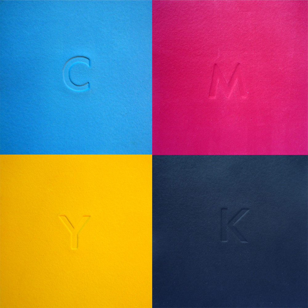
What is the Difference Between CMYK and RGB?
When it comes to creating visually appealing content, understanding the difference between CMYK and RGB is crucial. These color models are widely used in various applications, but they have distinct purposes and characteristics. Let’s explore the key differences between CMYK and RGB:
RGB for Digital Work
RGB, which stands for Red, Green, and Blue, is primarily used for digital work. It is an additive color model where the primary colors are combined to create a wide range of hues. When you see vibrant displays on your computer screen, mobile devices, or television, they are all created using RGB.
Branding, social media graphics, web design, and other digital content benefit greatly from the RGB color model. Its wide color gamut and ability to display vibrant and rich colors make it ideal for creating visually stunning digital assets.
CMYK for Print Projects
CMYK, which stands for Cyan, Magenta, Yellow, and Key (Black), is predominantly used for print projects. It is a subtractive color model that applies different ink combinations to achieve the desired colors. CMYK is commonly used in offset printing, digital printing, and other printing techniques.
When creating merchandise, advertising materials, brochures, and other printed materials, CMYK is the go-to color model. It ensures accurate color reproduction and consistency in print, resulting in high-quality outputs.
What Programs Use CMYK and RGB?
When it comes to graphic design software, CMYK and RGB are two popular color spaces used to create stunning visuals. Whether you are a professional graphic designer or an aspiring artist, understanding the difference between CMYK and RGB and knowing which programs support these color spaces is essential. In this article, we will explore the programs that utilize CMYK and RGB, providing you with the tools you need to bring your creative ideas to life.
Graphic Design Software
Adobe is a prominent name in the world of graphic design, and their suite of software programs, including Photoshop, Illustrator, and InDesign, support both CMYK and RGB. These powerful tools provide a vast range of features and options, allowing users to manipulate colors, create stunning images, and design professional layouts. Whether you’re working on a digital project or preparing designs for print, these industry-standard programs have got you covered.
In addition to Adobe’s suite, there are other graphic design software programs available that support both CMYK and RGB. CorelDRAW, for example, is a popular alternative that offers similar functionality. Affinity Designer, Sketch, and GIMP are also excellent choices for digital artists and designers looking to work in both color spaces.
Canva
If you prefer a more user-friendly and web-based design tool, Canva is a fantastic option. Initially, Canva only supported RGB color space, which is suitable for online designs. However, due to the increasing demand for print-ready designs, Canva now allows users to download their creations in CMYK color space as well. This feature is extremely useful for individuals who want to send their designs directly to print or collaborate with professional printing services.
Canva’s intuitive interface and vast library of pre-designed templates make it accessible for users of all skill levels. Whether you’re designing social media graphics, flyers, or business cards, Canva’s support for both CMYK and RGB ensures that your designs will look fantastic in any medium.
When it comes to graphic design software, having the ability to work in both CMYK and RGB color spaces is essential. Programs like Adobe Photoshop, Illustrator, and InDesign offer robust features for professional designers, while Canva provides a user-friendly web-based platform suitable for beginners and casual users.
Whether you’re creating digital graphics or preparing designs for print, understanding and utilizing CMYK and RGB will help you achieve the desired outcome. So, choose the software that best suits your needs and let your creative ideas shine.
How to Get the Best Print Color in Photoshop
When it comes to printing your digital designs or photographs, getting the color just right is crucial. The colors you see on your computer screen might not translate accurately to print, which can result in disappointing outcomes. However, by following a few simple steps in Photoshop, you can ensure that the colors in your prints are vibrant and true to your original vision.
Switch to CMYK Color Space
First and foremost, it is important to understand the difference between RGB (Red, Green, Blue) and CMYK (Cyan, Magenta, Yellow, Key) color spaces. RGB is the color mode used for digital screens, while CMYK is the standard for print. To get the best print color in Photoshop, you need to switch from RGB to CMYK.
To do this, you can begin by creating a new document in Photoshop and selecting CMYK as the color mode. This ensures that you start with the appropriate color space for print. Alternatively, if you already have an existing image or design in RGB, you can convert it to CMYK by going to the “Image” menu, selecting “Mode,” and then choosing “CMYK Color.”
Adjusting Colors for Print
Converting to CMYK alone is not enough to guarantee accurate print colors. You may also need to make additional adjustments to achieve the best results. Once you have switched to CMYK, open the “Image” menu again and select “Adjustments.” From there, you can fine-tune the brightness, contrast, and saturation of your image specifically for print.
Keep in mind that the colors you see on your computer screen are created using light, while printed colors are created using ink. This means that certain vibrant colors that are easily achievable in RGB may not be as achievable in the CMYK color space. It’s important to experiment and find a balance that maintains the integrity of your design while considering the limitations of print.
Soft Proofing for Print
Another helpful feature in Photoshop is the “Soft Proofing” function, which allows you to preview how your image will appear in print. To use this feature, go to the “View” menu, select “Proof Setup,” and then choose the appropriate CMYK profile for your printer or printing service.
Soft proofing gives you a more accurate representation of how your print will look by simulating the specific printer profile and the characteristics of the printing process. It can help you identify any potential issues, such as colors that are out of gamut and may not reproduce as desired. By adjusting your colors based on these soft proofing results, you can ensure that the final print closely matches what you see on your screen.
Switching from RGB to CMYK color space and making necessary adjustments in Photoshop are vital steps to ensure the best print color. However, it’s important to note that the final result is also influenced by factors beyond your control, such as the type of printer, paper, and ink used. To achieve the most accurate print colors, it’s advisable to consult with a professional printing service and request proof prints before committing to a large batch.
Do I Need to Convert RGB to CMYK for Printing?
When it comes to printing, accurate color reproduction is vital. In order to ensure that the colors in your artwork and files appear as intended, it is necessary to convert RGB (Red, Green, Blue) colors to CMYK (Cyan, Magenta, Yellow, Key) colors. Let’s explore why this conversion is important and how it affects the final printed product.
The Difference Between RGB and CMYK
RGB is the color space used for digital displays such as computer screens, cameras, and smartphones. It is an additive color model where the combination of red, green, and blue light creates various colors. On the other hand, CMYK is the color model used in printing. It is a subtractive color model where colors are created by subtracting different amounts of cyan, magenta, yellow, and black ink from a white background.
Why Convert RGB to CMYK for Printing?
Colors can appear differently when printed in CMYK compared to what you see on your screen in RGB. RGB has a wider color gamut, meaning it can produce a broader range of colors than CMYK. Therefore, if you provide artwork or files in RGB for printing, there is a possibility that the printed colors may not match your expectations or the vibrant hues you see on your screen.
Converting RGB to CMYK allows you to have more control over the color output during the printing process. By making this conversion, you can adjust the colors to ensure they appear as intended on the final printed material. This is particularly important for businesses and individuals who require color accuracy in their printed materials, such as designers, photographers, and marketing professionals.
Supplying Artwork and Files for Printing
Before submitting your artwork or files for printing, it is crucial to convert them from RGB to CMYK. You can easily do this using professional graphic design software such as Adobe Photoshop or Adobe Illustrator. These programs have color conversion options that allow you to make the necessary adjustments and ensure the colors translate accurately to the CMYK color space.
When converting from RGB to CMYK, it’s important to keep in mind that some colors may not have an exact match in the CMYK color space. This means that certain vibrant or neon colors may appear duller when printed. To avoid any surprises, it’s always a good idea to request a physical proof or a color swatch from your printing service provider before proceeding with a large print run.
Converting RGB to CMYK for printing is a necessary step to achieve accurate color reproduction. While it can be disappointing to see the vibrancy of RGB colors diminish when printed in CMYK, this conversion allows you to have better control over the final printed result. By making the conversion and checking the colors before printing, you can ensure that your printed materials look exactly as you intended them to, bringing your designs to life with precision and accuracy.
RGB or CMYK for Digital Art
When it comes to creating digital art, one of the important considerations is choosing the right color mode. The two most commonly used color modes are RGB (Red, Green, Blue) and CMYK (Cyan, Magenta, Yellow, Black). Each of these color modes has its advantages and is suitable for different purposes. In this article, we will explore when and why you should use RGB or CMYK for your digital artwork.
RGB for Digital Art
If your digital art will exclusively be used digitally, then RGB is the best option. RGB is an additive color model that produces colors by combining varying intensities of red, green, and blue light. This color mode is widely supported by digital devices such as computer screens, smartphones, and tablets. By creating your digital art in RGB, you can ensure that the colors will be displayed accurately and vibrantly on these devices.
With RGB, you have a wider range of colors to work with compared to CMYK. This is because RGB is capable of producing more vibrant and intense colors. It is ideal for creating artworks that rely on bright and saturated hues, such as digital illustrations and graphics for websites.
CMYK for Print
On the other hand, if you plan to print your digital art, it is recommended to convert it to CMYK for better color accuracy. CMYK is a subtractive color model used in the printing industry, where colors are created by subtracting varying amounts of cyan, magenta, yellow, and black ink.
Unlike RGB, CMYK colors may appear less vibrant and bright when printed. This is because the printing process has limitations in reproducing certain intense colors. However, CMYK offers a wider gamut for softer and more nuanced colors, making it suitable for printed materials such as posters, brochures, and art prints.
Considerations for Choosing the Right Color Mode
When deciding whether to use RGB or CMYK, here are some factors to consider:
- Intended Use: If your digital art is meant for screen display only, RGB is the way to go. If you anticipate printing your artwork, then converting it to CMYK is necessary.
- Color Accuracy: If color accuracy is crucial for your artwork, CMYK provides better control over how the colors will appear in print.
- Impact of Conversion: Keep in mind that converting RGB artwork to CMYK may cause slight color shifts, so it’s recommended to make any necessary adjustments before the conversion.
Tip: When working on a digital art project that will potentially be both digitally displayed and printed, it is advisable to create your artwork using a larger color workspace, such as Adobe RGB or ProPhoto RGB. This will give you more flexibility when converting to CMYK for printing while preserving the vibrant colors for digital displays.
Ultimately, the choice between RGB and CMYK for digital art depends on where and how the artwork will be used. By understanding the characteristics and limitations of each color mode, you can ensure that your digital artwork looks its best, whether it’s on a screen or in print.
Prepping File for Wall Art
If you plan to sell wall art, it’s important to consider the color mode of your digital designs. Wall art should be in CMYK format to ensure the colors appear the same when printed as they do on screen.
When creating digital designs for wall art, it’s essential to take into account how the colors will translate from the digital screen to the final printed product. The color mode used in your design files can greatly impact the final result.
CMYK, which stands for Cyan, Magenta, Yellow, and Key (black), is the standard color mode for professional printing. Unlike RGB (Red, Green, Blue), which is used for digital displays, CMYK is optimized for printing with ink on paper. It’s crucial to work in CMYK mode when creating wall art to ensure that the colors are accurately represented in the final print.
When a design file is in RGB mode, it uses a wider color gamut than CMYK, which means it can reproduce colors that are outside the range that can be printed. This can lead to a discrepancy between the colors seen on the screen and those produced in the print. Colors that appear vibrant and bright on a digital display may appear dull or different when printed in CMYK.
Converting your design files to CMYK before printing is essential to achieving the desired results. Most professional design software, such as Adobe Photoshop or Illustrator, allows you to easily switch between color modes. Simply select the CMYK color mode before starting your design or convert the file before sending it for printing.
In addition to the color mode, it’s also crucial to consider other aspects of prepping your file for wall art. This includes ensuring that your design has the proper resolution for printing, using the correct file format (such as TIFF or PDF), and providing any necessary bleed or trim areas. These factors will vary depending on the specific requirements of your printing method.
By taking the time to prep your file correctly, you can ensure that your wall art looks just as intended when printed. This will help you deliver a high-quality product to your customers and build a reputation for professionalism and attention to detail. Remember, the right color mode can make a significant difference in how your wall art is perceived, so always work in CMYK for print.
To summarize:
- RGB is best for branding, social media graphics, web design, and other digital content.
- CMYK is best for branding, merchandise, advertising, and other printed materials.
By optimizing your color choices for each medium, you can create visually striking and consistent content that effectively communicates your message.