The Art and Science of Color: A Guide for New Designers
Have students click/scan the QR code below to view the video then complete the quiz challenge.
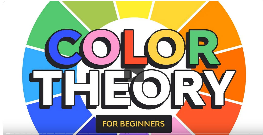
Transcript of video
Colors are a powerful visual tool. They have the ability to evoke emotions. And in brand design, they can represent a lot more than just a color palette or a brand. Hi, my name is Laura Kyung, and I am a graphic designer with over 15 years of experience. In this course, you will learn everything you need to know about color theory.
We will start with a color wheel, how to use it and what it is, how you can create color harmonies and a color palette, when to use RGB and CMYK, and how to create a color palette that goes with a brand. I’ll show you real life examples from Envato Elements so you can understand all about color theory. Envato Elements is a great resource for high quality templates, photographs, fonts, and much more. So let’s get started. In color theory, colors are organized on a wheel.
And in order to understand how harmonies work, we need to understand how this color wheel works. And Sir Isaac Newton invented this color wheel in 1666. And now it can help us understand how colors can work together. So in order to create harmonies that are pleasing to the eye and communicate and evoke certain emotions, we can use this very handy tool. You probably heard it in school and the color wheel consists of 3 primary colors.
We have red, yellow, and blue. These 3 colors are very contrasting and they can be used as a single color palette like in this example. Now if we mix these 3 primary colors, we will get these other 3 secondary colors, and those are green, purple, and orange. This is also another contrasting color palette of only 3 colors like in this example. And by mixing primary and secondary colors, we can get tertiary colors.
So you could get something in between, so an orangey yellow or a red that is a little bit more orange, and so on. We don’t see these colors mixed together that often because they are so contrasting and have so much saturation. That means that they are very vibrant, so they can compete with each other. There are also color qualities for each color on the wheel. So here we have hue, saturation, and value.
Hue is any color on the wheel that has its maximum saturation. When we speak about saturation, we’re speaking about the vibrancy of the color. So a desaturated color means that it is dull, and a very saturated color means that it’s the most vibrant. And then we have value, and this has to do on how light or dark a color is. And this is where we get into shade, tint, and tone.
But before that, I want to show an example of hue, saturation, and value. We have this beautiful polygon background image. It’s very abstract and it has so many colors with different hues and different saturations and values. And we can see that when we turn it into black and white. We can see the high contrast between all of these colors.
We can see that some colors have different values compared to darker colors or even lighter colors like yellow. Let’s talk about the next examples. A shade is created by adding black to a hue in order to darken the color for it to be richer. Tint is created by adding white to make a color a little bit less intense, while tone is created by adding gray to a hue. The color wheel can also be split into temperatures, 2 main temperatures, and that would be warm and cool.
Warm colors are associated with the sun, energy, warmth, fire. And these would be usually yellow, red, orange, and all of it, there are different shades and tones. While cool colors are associated with calm, tranquility, and peace. And the same as the warm colors, we have to consider all of the shades and tones. When we combine hue, saturation, value, temperature, shade, tint, and tone, we find ourselves with a myriad of color combinations, so let’s take a look at some of these textbook harmonies that you can use to create color palettes.
Color harmony refers to colors that just work beautifully together, that look balanced and appealing. So let’s use the color wheel in order to understand some of these harmonies that will help us in the future put color palettes together that just simply work. First, we have complementary. So complementary colors are pairs of 2 colors that are directly opposite from each other. So in this example, we have red and green, and this helps us create a very strong contrast.
On this first example, we have orange and blue, and these 2 colors sit opposite each other on the color wheel. We can see that they just create a very strong contrast. The yellow is just in the background, But right now we want to focus on the 2 main elements. And on this next example, we have a combination of colors, but it’s mostly at the bottom we have red and green. And again, these 2 also sit opposite of each other.
Next up, we have analogous. And this color harmony works by combining a main color with colors that sit next to it. So in this first example, we have a green And then another lighter or a little bit more dull green, a combination of green and yellow, and then we have yellow. So this color harmony tends to be a little bit more calming and easy to apply. On the second color wheel, we’ll have a magenta or purple and a blue purple.
And again, these 3 colors just work naturally together. On this first example, we have a landing page that has green colors and greens are a little bit more yellow. And then we have a lighter tone of yellow and just right at the bottom where the walkway is. On the second example, we have again a variation of blue, fuchsia, magenta, and just a little bit of blue popping around to create a little bit more contrast. We can see how these colors work really well as gradients too.
Next we have monochromatic, and this takes just 1 basic color or hue from the wheel, and it uses different shades, tones, and tints to create a color palette. It looks very simple and cohesive. For instance here, we choose 1 hue and then we can work our way to a different tint, tone, or shade, depending on how many colors you want on the palette. We have here a cool geometric background and it has the same blue and green in this case. But it’s also using different tints, tones and shades to create a depth of field or create lighter, more prominent triangles.
And on the second example, we can see the different oranges on the pumpkins. So from top to bottom, we can see, and even also on the shadow and the light to create more depth on the pumpkins. We can see that there are different shades, tints and tones of the same orange color. Next up, we have a triadic color scheme. And this uses 3 colors are evenly spaced on the color wheel to form a triangle.
So like we saw on the first example, the primary colors here we have blue, yellow, and red. And on the second example, we can see a combination of the secondary colors, green, orange, and purple. On this primary color example, we have red, yellow, and blue, and we can see that it just works beautifully. All of the colors are used very evenly, So there is not 1 color that overpowers the rest. And on the second example, we can see that there is more than 3 colors.
The blue is used as a background color, it’s adding a lot of contrast. And the orange, the green, and purple are being used as accent colors. Tetradic colors are 2 sets of complementary colors that work together as a whole palette. These colors work best when 1 of the colors is the dominant 1 in the palette, and the last 3 are used as accent. In this case, we have a yellowish green, a yellowish orange, a purpley blue, and a magenta together.
And because these are such vibrant colors, 1 of these would have to be used as a contrasting color or as 1 color that overpowers the rest. And the last example was a great example of that. The second color wheel shows a blue, green, magenta, and orange. And again, 1 of these colors will have to be the 1 that takes over the other 3, and if we don’t want them to be super vibrant, we can use different tints, tones, and shades of the other 3 colors. This landing page is a good example of using just contrasting colors or accent colors.
And here we have the orange, blue and green as little accent colors. And then we have the magenta that takes over most of the landing page. The second example is using a little bit more balance between 3 colors and the green is used just sparingly. We can see in here Just a line right in the middle, but the blue, the red, and the yellow are overtaking most of the design. These harmonies are a great guide to create color palettes that work together.
Adding tints, shades, and tones allows you to mix and match different colors and achieve a good looking color palette. As designers, we’ll need to either output our work on paper or screen, and there are 2 different color modes to use that will optimize the way you work. Let’s take a look at RGB and CMYK. You probably have heard of color spaces. And these are 2 concepts that are really important to know, especially if you’re a graphic designer.
Depending on what your project will end up as, so if it will be printed or if it will be shown on screen, you will need to choose the right color space right from the get go when you start your design. So that way you can work with the right color space. But also you can save time and keep a tidy file, and it will just be easier for everyone involved in your design process. So There are 2 color spaces and that’s CMYK and RGB. These spaces are again used depending on the medium that your design will end up on.
RGB stands for red, green, and blue. And this is the color mode for any device that needs light to show color. RGB uses the additive color method and that means that when all the colors are combined, we get white. CMYK stands for cyan, magenta, yellow, and black. This is a color mode to use if the design will be physically printed.
CMYK uses the subtracted color mixing method. So this color mode starts with a white paper and then we subtract color until we get to black. 1 important thing to know is that the colors we see on screens will never be as vibrant when they’re printed. So these colors get slightly washed out. That’s because the CMYK method is very limited compared to the amount of colors we can create with RGB.
That’s why when you see colors on a screen, they look a lot brighter. Sometimes you can even get to neon colors, but these won’t get printed on a CMYK method unless you’re using a pen tone color and that would be a specialized color. So to recap, the RGB color mode can only be used if your design will end up on a screen. So if you will be showing it on an iPad, if it will be a website, or if it’s an application, a phone application, things like that, they should start as an RGB color mode. And if your design will be printed on a page, on a t-shirt, or as packaging, then you need to start your file as a CMYK color mode.
It is essential for designers to know the difference between these 2 color modes and when to use them, especially if you’re working with a design team that needs to keep files tidy and organized or if someone else will be working on your file. So now that you know the difference between these 2 color modes, let’s take a look at how you can create a color palette. Creating your own color palette can be quite intimidating. But now that you understand color theory and how the color wheel works, it can be easy. There are a few things to consider.
Just like warm colors represent passion, energy, and cool colors can represent calm and tranquility. The rest of the color wheel can also evoke certain emotions and behaviors. Color psychology can be a powerful tool in graphic design that can help us evoke certain emotions from our target market. There are different factors that can affect the way people perceive colors. And those would be different cultural backgrounds, age, gender, and sometimes even life experience.
But there are very specific colors that can evoke very specific emotions. Let’s take a look at some of these colors. Red Usually represents passion, strength, power. We can see that on this logo, we have the majority of it red. And on this other artwork where there is a combination of red, black, white, and blue.
From the color wheel perspective, there is a lot of contrast here. That’s why the red works really well. Blue can be perceived as a calming color. It can mean trust and stability. Many corporations and brands that want to be perceived as serious brands use blue.
Many of the brands that have anything to do with technology or looking to convey trust also use this color. Next we have green, and green is nature, growth, and serenity. Many brands that are connected with environment work or healthcare also use this color. This illustration represents that idea perfectly. Next we have yellow and that can represent happiness, energy, and friendliness.
Yellow is usually used for anything related to kids because it’s such a friendly color, an easygoing color. We can see that in this illustration. And on this flyer, the combination of all of these colors, but the yellow is overtaking most of it. It makes us feel that this is directed to kids. Purple represents luxury, nobility, and power.
Many high end brands tend to use this color. Brands that want to come across as elegant, serious, and expensive. Like we said, purple can represent luxury. And we can see that on this layout, it is beautifully designed, very simple, a lot of white space and just letting the color speak. Last, we have orange, And that represents optimism, creativity, and warmth.
Orange is a loud color, very bright, very energetic. Many brands that want to look alive and ready use orange. On this example, orange is very loud and it’s used in combination with yellow to contrast it but also to balance it. In here, we also have an illustration with orange, yellow, and a very dull green that is helping balance the brightness of the reddish orange and the yellow colors. So now that you know the basics of color psychology, the color wheel and color harmonies, let’s take a look at how you can create your own color palette.
Here I have the color wheel and all of the color harmonies just to guide us. And here I want to create, let’s create a square. It’ll make it easier for us. I want to choose a color, I will choose blue to start with, that will be my main color. Based on the complementary harmony, I will choose the colors that are next to the complementary color.
So yellow and orange. And here we’ll have our accent colors. I have this black rectangle and here I want to test the saturation. So ideally our color palette would have a different contrast in saturation between all of the colors. I am doing this by just creating a black rectangle and setting the transparency to color.
So here I want the blue to have a little bit more contrast compared to the rest of the palette. Now we can see that the yellow and the blue have more contrast. I want something in between for the orange. So let’s tweak this a little bit. And here we have our color palette with black and white as a neutral colors.
So let’s say that we want the black and white to be different neutral colors that go more with the palette. So let’s choose this and base it on the yellow, and I just want sort of a neutral yellow. There will be a lot of tweaking to find the right shade, tone, and tint. Let’s do the second 1. And here I want a little bit, maybe a blue.
It can be a blue or it can be just a very, very neutral color. And again, let’s drag the black. And here we just need to tweak the yellow a little bit more. So here we have our first color palette with black and gray. And then we have the second palette with a neutral color that is neither black or gray, and 1 gray color.
Let’s create a second 1, get back to the beginning. And let’s base this on an analogous color harmony. So we have the green, the lime green and the yellow. And then the total opposite of that would be the magenta. And then I want a neutral green here.
So let’s start tweaking. Here I am looking for something, the second main color and the yellow I want to sort of create more of a contrast between the first 2 main colors. The magenta is a good color but it’s not of my preference and this is where you have to use your design intuition as judgment. Here the magenta I want to maybe make it a little bit darker, so we can add more cyan. And then the neutral color, I want to have a bit of a pink undertone.
So let’s get back our rectangle here to look at the saturation. I want to tweak this green to be a little bit brighter compared to the first 1. And here let’s put the yellow on top to see if it works well with both greens. Let’s do the same with the magenta. This is vibrating a little bit, so let’s tweak these.
We can make it darker, make it lighter. And again, here we can keep tweaking. So I think I prefer the purple. And here we can keep tweaking until we find the right color. So the magenta seems a little bit bright, it will take away too much from the green.
Let’s bring the black rectangle here to check on the saturation or the value. And that seems to be working better for me. So this is where you use your design intuition to guide yourself if this is a color palette that you want to go for. And to me this color palette it is fun, it is vibrant because we have 2 very bright greens but also we have a little bit more of a tone down yellow and purple. Now let’s take a look how this would look like with just a black and gray.
So 1 last color palette in here, I want to use the tetradic colors. So these colors are 2 complementary colors opposite each other. And because these are such bright colors, using them all together in the same ratio would be too much. So we have to find 1 dominant color and then the rest of the colors would just be used as accent colors. And just to demonstrate the color ratio, I want to change the size of these rectangles.
Let’s bring our black rectangle here and let’s start tweaking the colors. So I want a very bright green, maybe a paler yellow. Let’s test this purpley blue here. Maybe something bright, maybe something dark. The pink I want to make a little bit paler and then the neutral color at the very right, I just want to make it very, very light.
Let’s tweak again this green. And remember, we’re looking for balance, harmony, and also some of your designer intuition here to make this color palette work. The green, I want it more saturated. This orangey yellow a little bit lighter. And there we have it, a very strong color palette that is different from the 1 on the left, even though the colors are similar.
But by using different tints, tones, and shades, you can evoke different feelings and emotions. As you’ve seen, each color can evoke certain emotions and communicate more than what it shows. Creating your own color palette won’t be difficult anymore now that you learned how to work out color harmonies and combine them with the different color qualities. Now you know all the basic color theory to get started on your own project. So let’s recap what you learned on this course.
Colors are a powerful visual tool that can evoke different feelings and emotions. When used correctly, a color palette can not only represent a brand, but also communicate an idea. In this course, you’ll learn what is a color wheel, how to use it, how it is classified, the different ways it can be classified. You also learn color harmony, so you can create your own color palette, the difference between RGB and CMYK, and some color psychology.